Technology & Information For All
Assessing the user’s understanding of the goal
Role | UX Designer and Researcher
Methods Used | Comparative & Competitive Analysis, Usability Testing, Affinity Mapping, User Persona, Journey Mapping, A/B Testing, User Flows, Site Mapping, Wire framing, Prototyping and Iteration
Duration | 3 months
Project Overview | Website redesign of TINFA’s homepage and navigation. The primary goal was to increase understanding of what the organization does and increase engagement on the website.
Client | TINFA (Technology and INformation For All)
Context and Challenge
Understanding the Business
TINFA’s goal is to help teachers in developing countries learn technical skills to improve education in schools. They also invest in essential classroom tools such as laptops and projectors.
TINFA’s Goals
We worked with the executive director and president to make changes to TINFA’s website that were easy to adjust and effective in achieving their goals.
TINFA’s primary goal was to increase user engagement. They wanted to increase traffic to their website, increase newsletter signups and ultimately increase donations.
The founders wanted to create more organic search traffic by improving their SEO.
Most people who knew about TINFA, heard about it through word of mouth or had a connection to the staff.
Discovery
Initial Issues found in Usability Testing
Homepage
The Learn More button was distracting.
The first line of text was broad and didn’t show people what TINFA did and how they did it.
Navigation didn’t have enough contrast.
Body
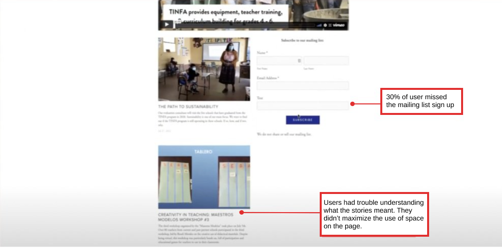
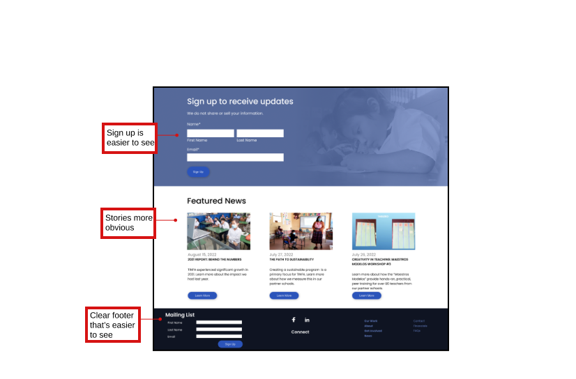
The mailing list sign up was difficult for users to locate.
The purpose of the stories lacked clarity
Navigation
The mailing list sign up was difficult for users to locate.
The purpose of the stories lacked clarity
Footer
The footer’s call to actor wasn’t obvious.
We wanted to make it more visually interesting
Identifying Patterns
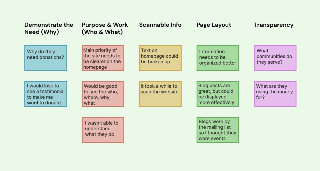
Usability Testing Summary
People wanted to see visual insights of statistics on what the
organization accomplished and their impact.Text was small and hard to see; it needed a better visual hierarchy.
Observing the Nonprofit Landscape
Focusing on consistency and standards
through comparative and competitive research
I researched a variety of competitors and comparators including: Pivotal Ventures, Build On. We.org, TNTP and Commit2Change.
I focused on how these nonprofits displayed information in a digestible way and how they communicated their mission and impact.
What they did to help their users navigate their website.
I identified the industry’s best practices that would support an intuitive non-profit website.
Shows statistics and bolds the numbers showing why their cause is important
Navigation can be found throughout the site, not just in the header.
The newsletter sign-up feature was highly visible and easy to locate.
Define
With the research phase behind us, we moved on to defining our design strategy, putting our findings into action.
The Community Advocate
About
25 - 60 years old
Enjoys being active in the community and making an impact
They are deeply committed to their community and have a strong desire to make a positive impact.
Goals
Wants a quick overview of the organization’s mission
Wants to make a positive difference in community
Needs
Needs to see the impact of the organization’s work
Needs to trust that donation is making a difference
Frustrations
When an organization isn’t transparent about where the donations go
When they don’t know how to find more information on a webpage
Problem: The community advocate, needs to have a clear idea of what TINFA specifically does and how they achieve their goals so that they can get more involved.
Initial Designs
To begin, we drew inspiration from various patterns observed in successful nonprofits, which influenced our redesigned layout. Our primary focus was addressing the key challenges identified during testing. We scrutinized the navigation, wording, and image placement to enhance the overall user experience.
Mid-Fi Testing
Once we developed a basic wireframe, we proceeded to incorporate color into our prototype. Subsequently, we conducted additional user testing to ensure smooth navigation. During this process, we identified the need to adjust color, contrast and address spacing issues. Moreover, we explored ways to enhance user understanding of TINFA.
A/B Testing
Based on our initial tests, we discovered that a significant number of individuals encountered confusion regarding two navigation categories. They perceived "What we do" and "About" as being too alike and struggled to grasp the distinction between them. To determine the optimal solution, we conducted A/B testing. In the first test, we changed the label of "What we do" to "Our Work," while in the second test, we relabeled it as "Approach."
After analyzing the test outcomes, we determined that the label "Our Work" proved to be more effective in clarifying the category's content and purpose to users. It provided a clearer and more intuitive representation, reducing confusion and enhancing user’s comprehension.
Final Design
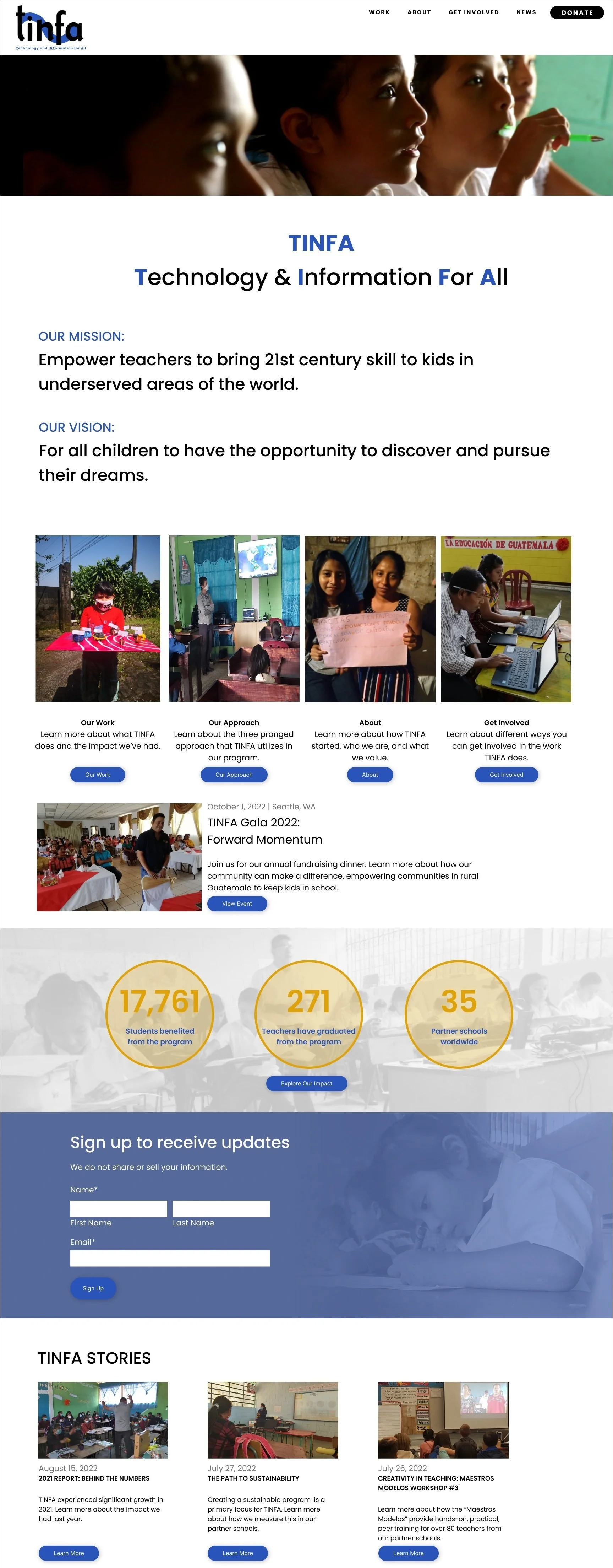
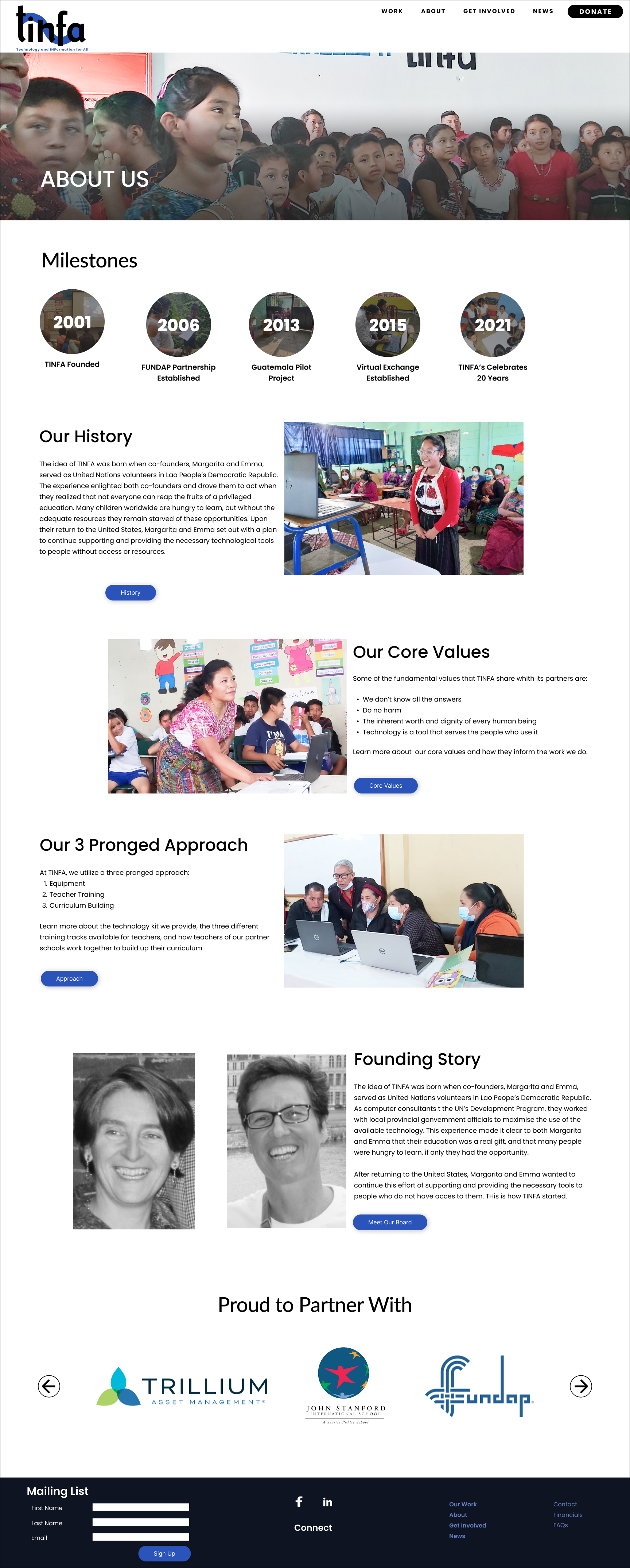
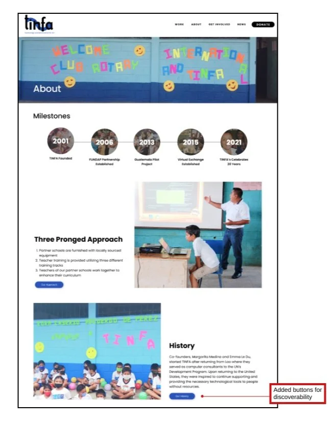
We made some small changes to the HiFi that address the issues found in our Mid-Fidelity usability testing. We added testimonials to enhance credibility and a section on the first page that explained what TINFA does.
Reflection
Establishing effective collaboration with stakeholders through open communication and regular meetings enabled us to align our goals with theirs while gaining insights into users' website-related challenges. Since the project was constrained to Squarespace, we ensured that all our actions were compatible with the platform. It was a rewarding experience to closely collaborate with a nonprofit dedicated to making a positive impact on the community.

