Refining The True It Naturals Website
An e-commerce skincare client project over a 3 week period
Client | True It Naturals
Role | I worked as the UX/UI designer on a team with another UX designer and a Product Manager. I researched and designed as well as created components and interactions in Figma.
Deliverables | Research, recommendations and the wireframe
Context | True It Naturals, an e-commerce skin care company, wanted to redesign its website. They wanted to better show the value of their skincare products, increase sales, and have a website that expressed a fun, yet credible brand.
Methods Used | Comparative & Competitive Analysis, Usability Testing, User Persona, User Flows, Site Mapping, Wire-framing in Figma, Prototyping and Iteration
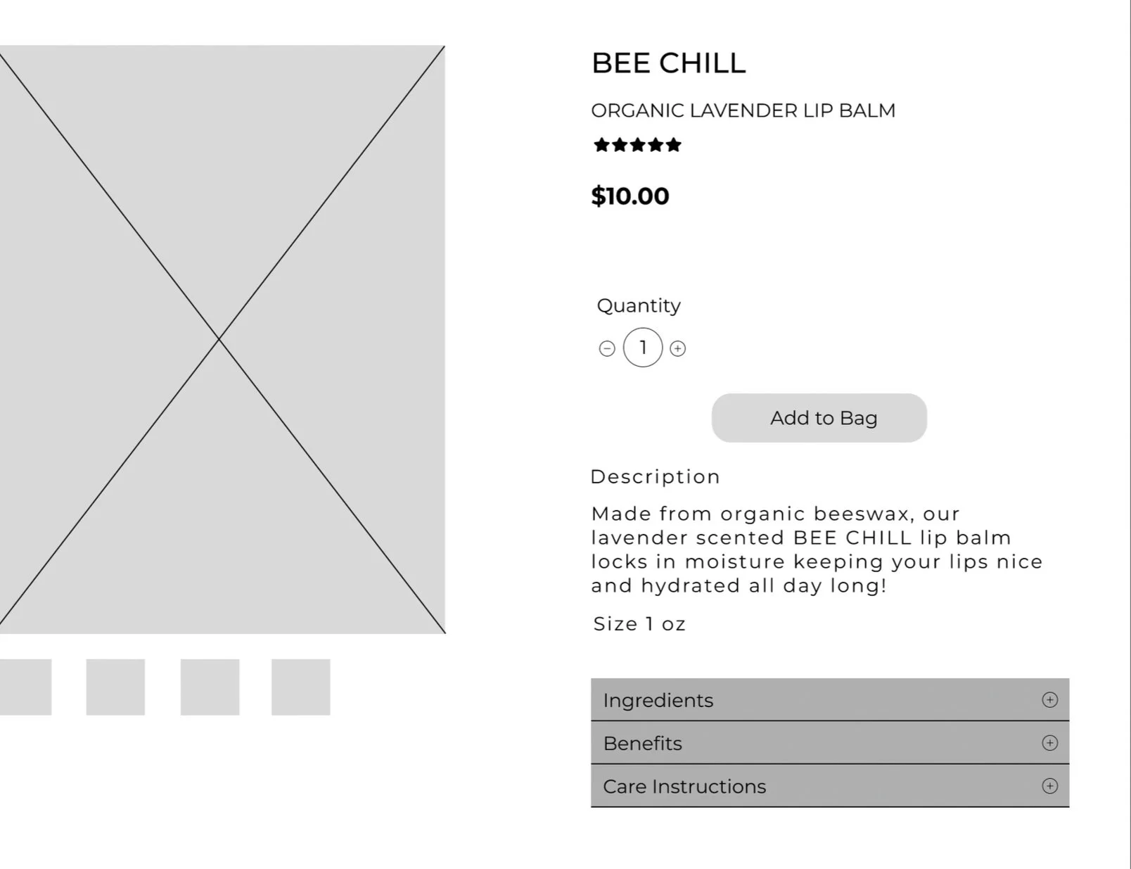
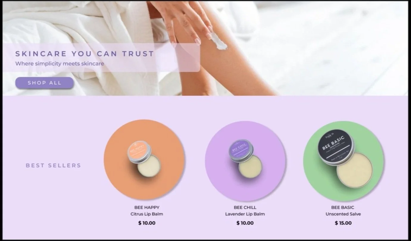
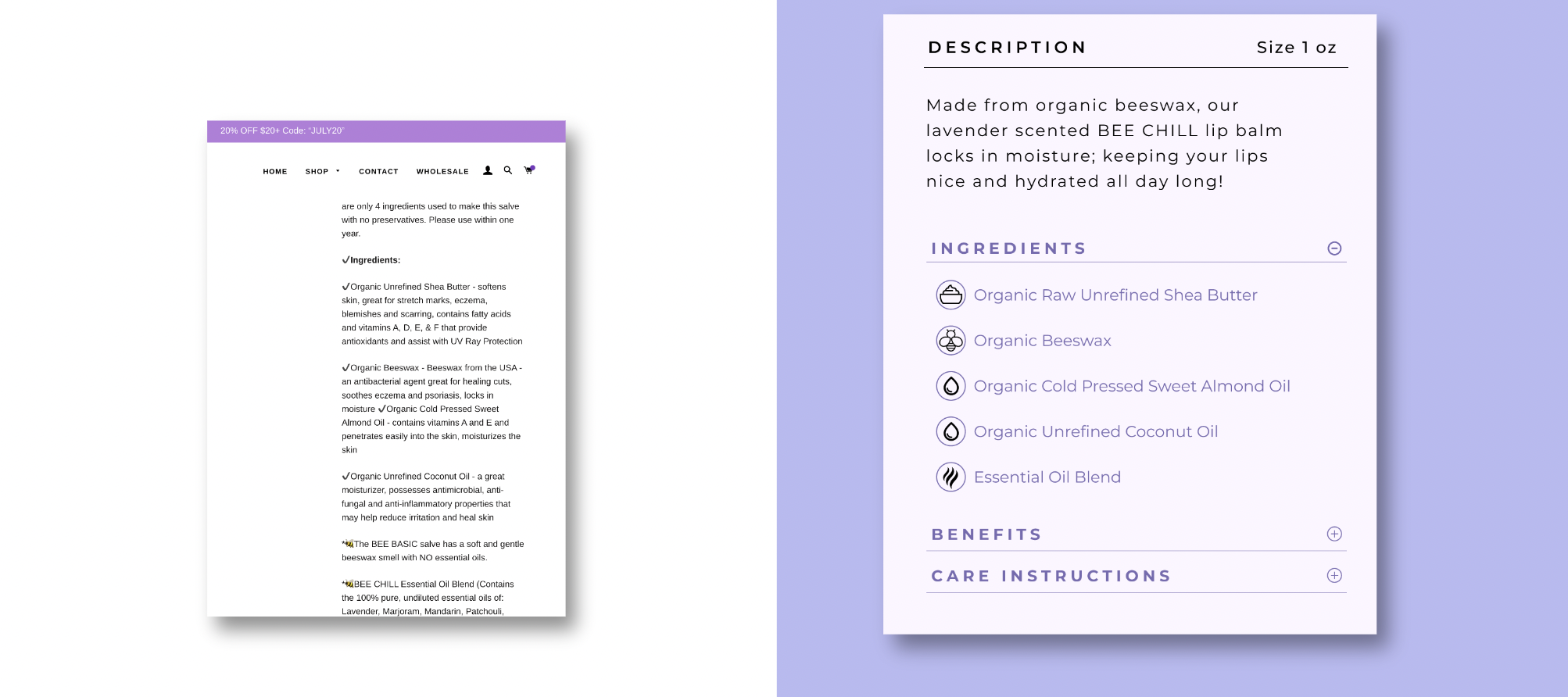
Solution | In order to show the value of skin care products, I clearly separated the ingredients, benefits, and care instructions on the product page, which allowed users to more easily view critical information about each product. I added icons that decreased users’ cognitive load while fitting True It Natural’s fun brand, added a testimonials section to increase brand credibility, and added featured product sections that made it easier for users to view products.
Business Impact | Site is live today! Our redesign grew the total website sales by 39%.
Context and Challenge
Understanding the Business
Our client, a small business owner started making skincare products during the pandemic for friends and family. This led to her selling it in farmers markets and then creating a website to grow her business.
The founder wanted to increase sales directly from her website.
Most of the sales were coming from Etsy and they took 6% of her profit so she needed to increase traffic to her website. She wanted customers to understand why they should pay $15 for a salve.
Discovery
User Research
We conducted surveys to gather general information from the target client. We then interviewed skincare enthusiasts to dig deeper into our research.
Common Themes in our Interviews
People like to know what was in their skin care products that they were purchasing
Shopping online makes it easy to find products that fit their needs
People base their purchases on recommendations from others and reviews
Key Insights from our Survey
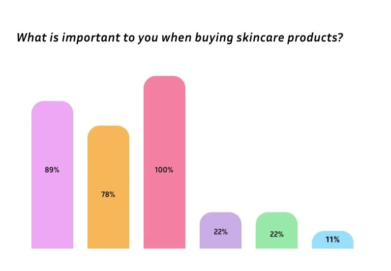
Top 3 most important things to look for in skincare products: Ingredients, Quality, Price
66% of survey participants look for all natural ingredients in their products.
Current State Usability Testing
Navigation
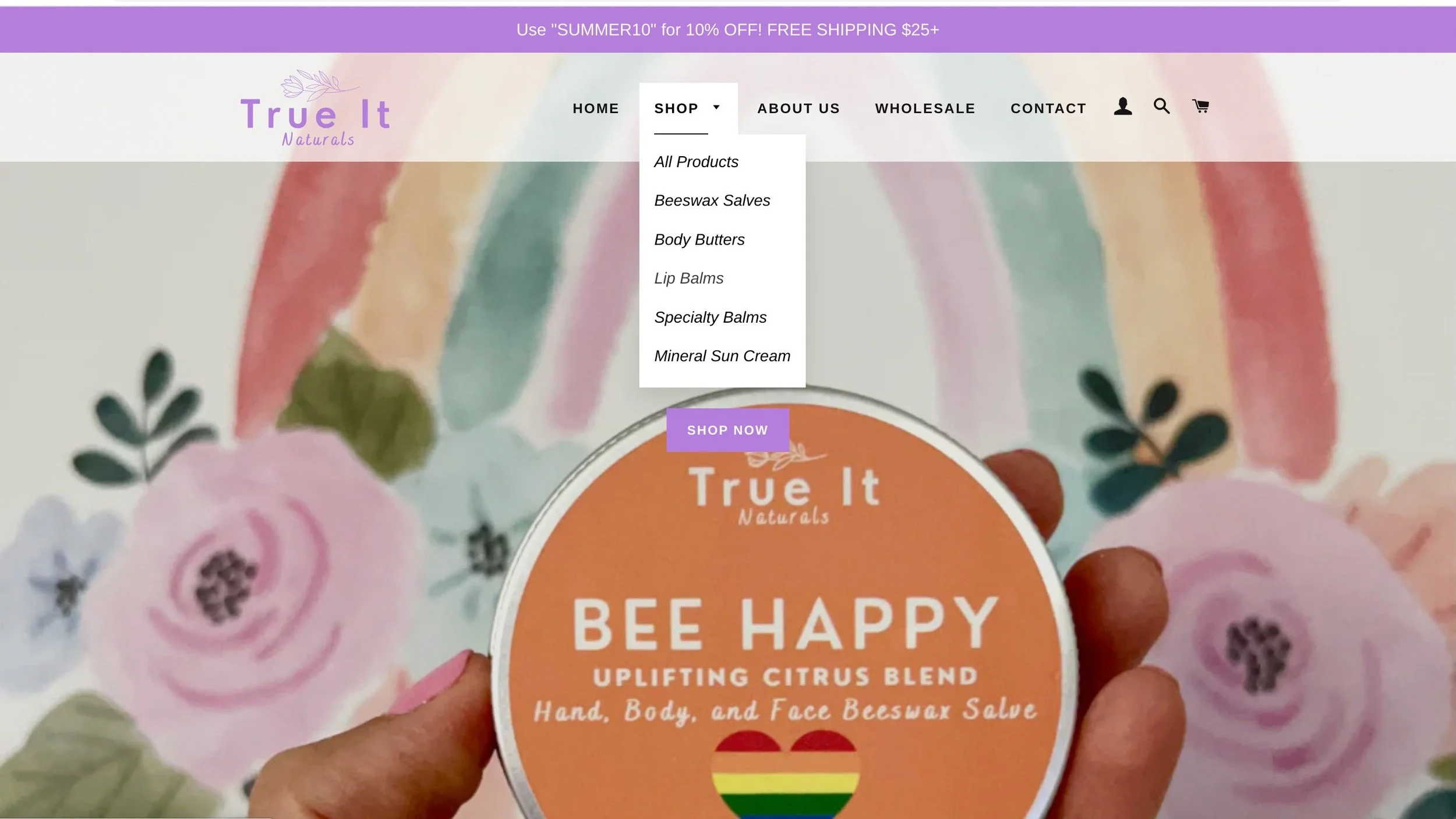
75% of users found the navigation unclear due to the lack of feedback.
“An organized navigation and clean aesthetic helps build trust in the brand” -Interviewee
About Us
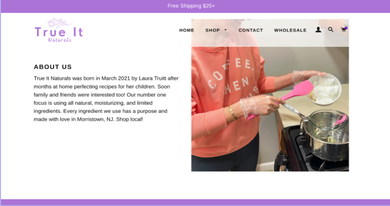
75% said they would like more information about the founder of True It Naturals.
“I would like to see what goes into creating the product; whats behind the brand.” -Interviewee
Ingredients
50% found the ingredients list too long. It was so much information that it buried the benefits.
“The long list of ingredients distracted from the discovery of the product’s benefits.” -Interviewee
Defining the Problem
Business Challenges
How might we differentiate True It Naturals from other skincare brands?
How might we make the website fun and easy to use?
How might we promote transparency and enhance credibility on this website?
The User’s Problem
Skincare shoppers need to understand the value and authenticity of the True It Naturals products to spark an interest in their products.
Initial Designs
Navigation
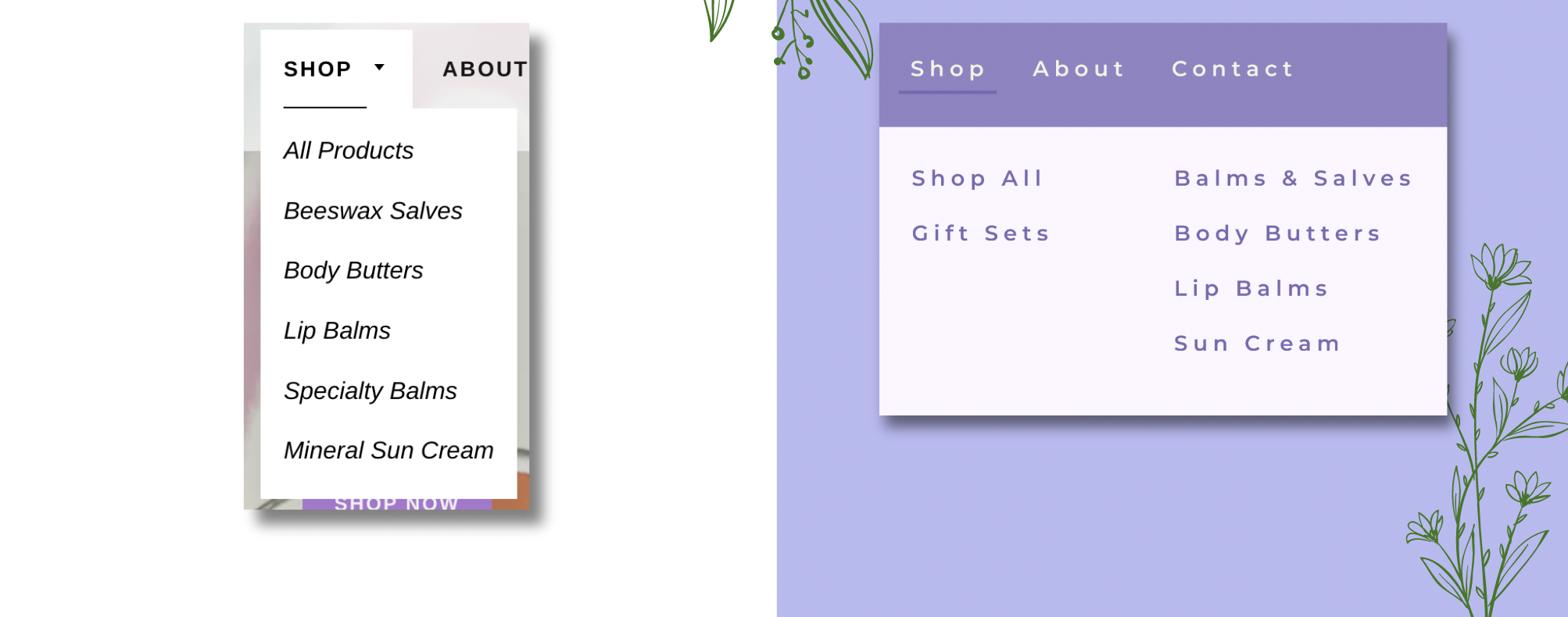
I worked on making sure that the navigation was interactive and gave feedback so that users would know if they were hovering on a category.
Accordion Menu
Since many users were overwhelmed by the long detailed lost of Ingredients, benefits, and care instructions all together. I separated them with an accordion menu.
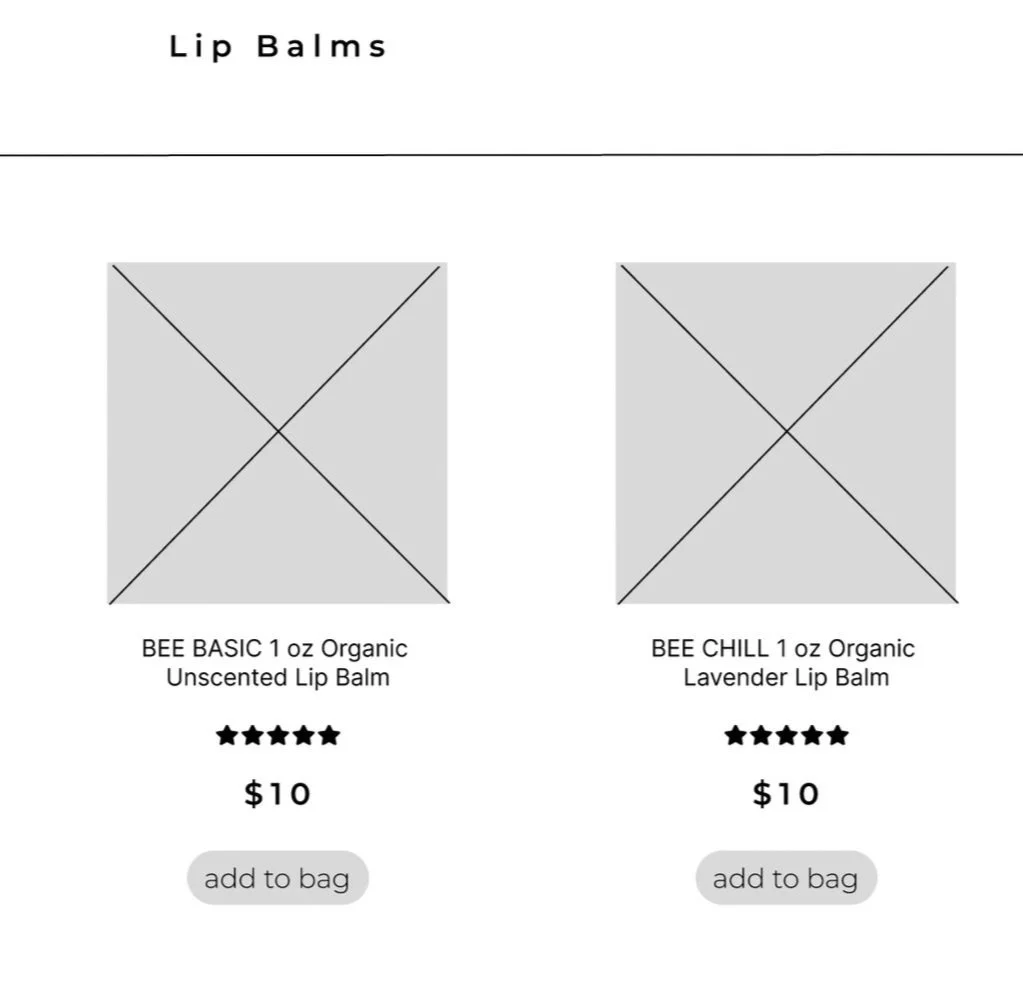
Product List Page
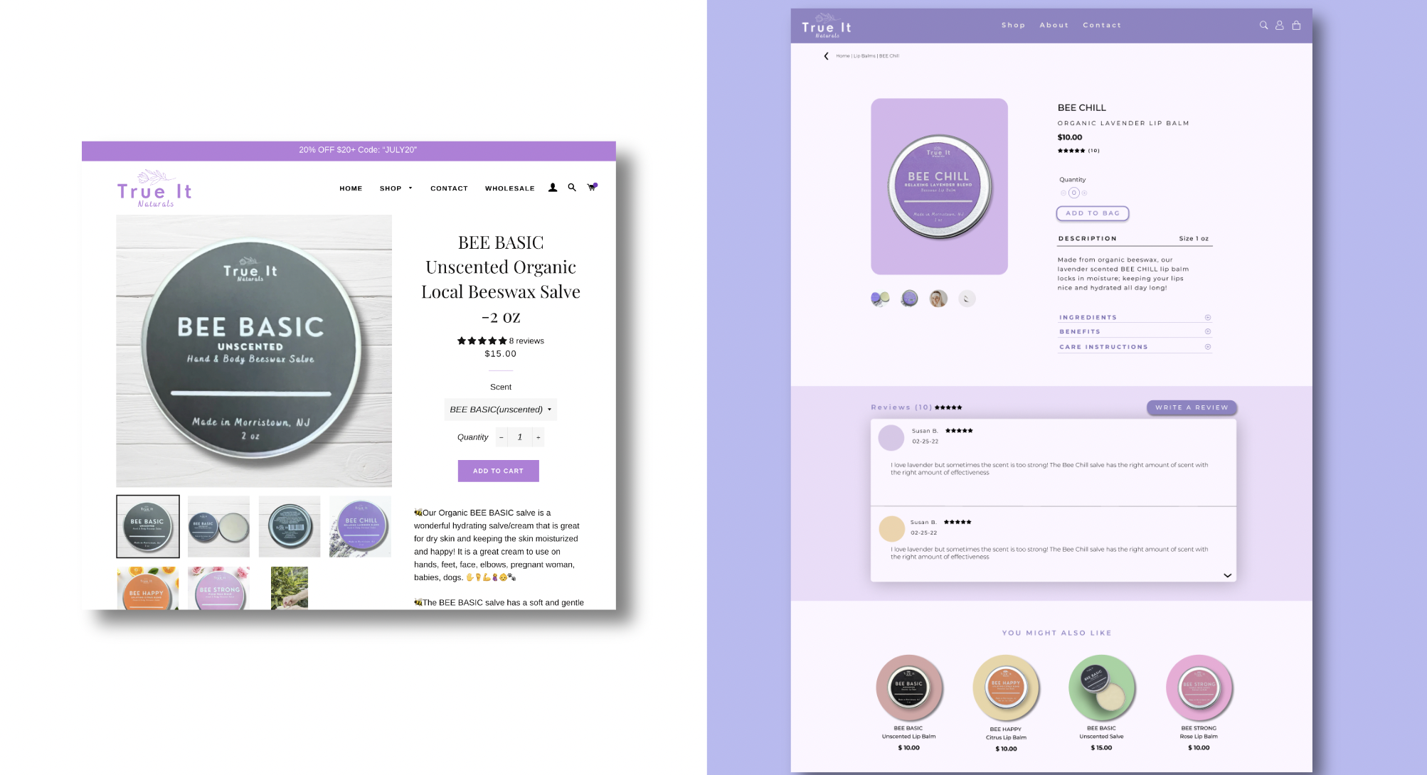
For returning customers, I made an add to bag option on the product page to reduce the number of clicks. This was popular on the skincare websites we’d researched.
User Feedback & Improvements
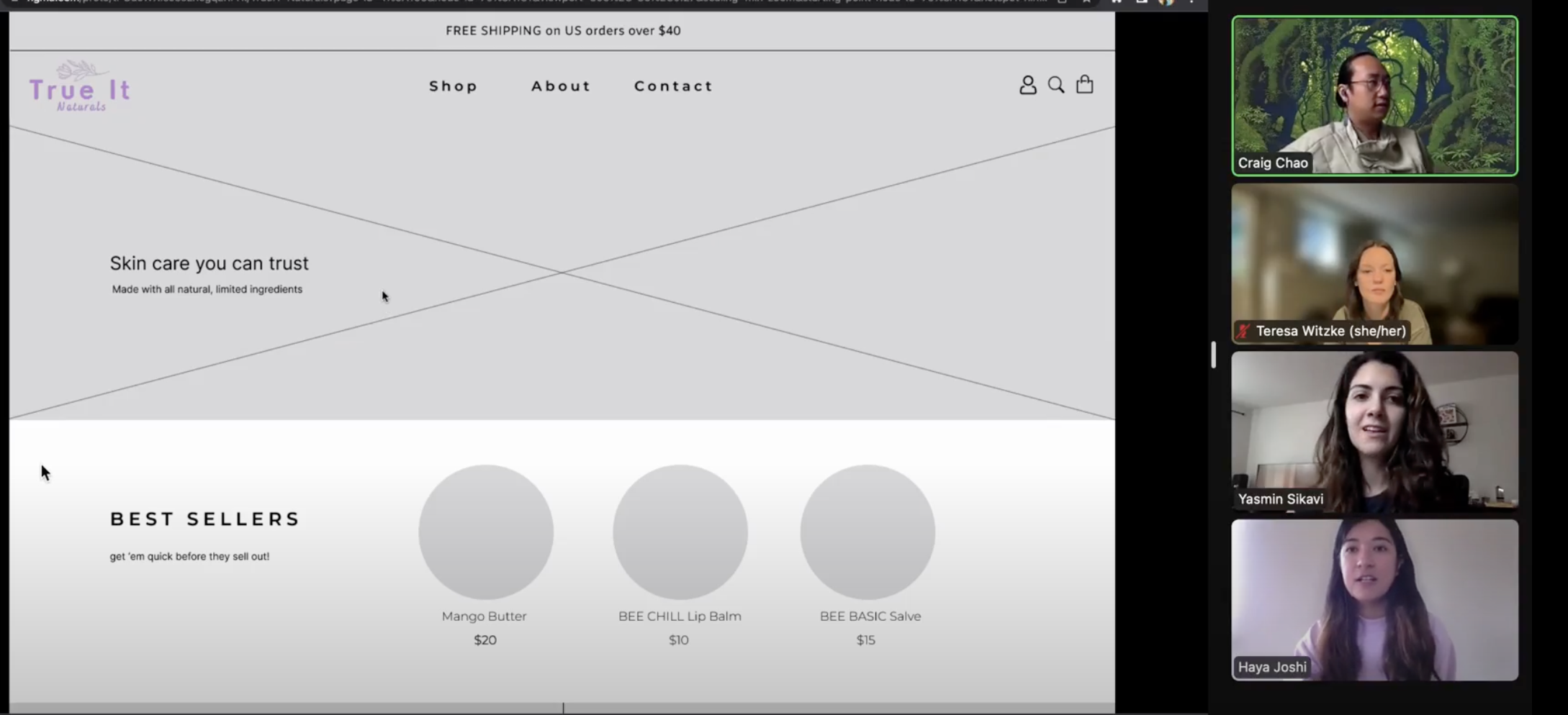
Greyscale Usability Test
We conducted another usability test to see if the changes from our wireframe made a positive impact.
Usability Test Findings
Having multiple avenues of accessing the product page is crucial.
Seeing reviews or testimonials on the main page adds credibility.
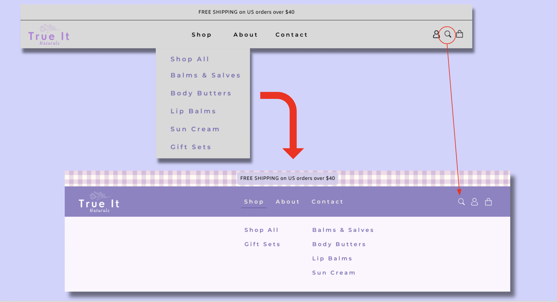
The navigation menu was still difficult to read due to the length.
Changes We Implemented From Testing
Navigation
In our greyscale usability test we found that users struggled with a lengthy navigation menu and had a hard time finding the search icon.
With this in mind, we pivoted to a split navigation menu and made the search icon easier to access.
Testimonials
Another notable change we made inspired by our usability test observations was adding testimonials to the main page.
This helped to create trust in the True It Naturals products by adding credibility.
Design Deliverables
Style Guide
We created a style guide to ensure that we were all on the same page when creating the User Interface.
Color Palette
Header
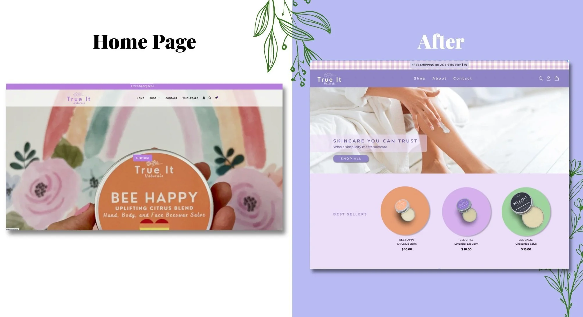
I had the idea to change the header from a translucent white with light purple to a darker purple with white text so that there would be a greater contrast and users would have an easier time reading the text. I also decided to use the lighter purple as a background on the body of the page to complement the header.
Icons
We saw that websites from our Comparative Analysis used icons to clearly demonstrate their values. We decided to add these to the website so that users could quickly get an idea of the quality True It Naturals was selling.
Behind our guide the intention was to stay true to the True It Naturals brand by using purple and other colors that were reflected their products.
Final Wireframe
Key Results
Our client worked right away on implementing most of the changes we’d suggested.
We followed up with her 6 months after we sent our recommendations. Below are the improvements she’s seen since the redesign:
Grew total website sales +39%
Average order value grew +44%
Increased overall sessions by +26% across an increase of +26% site visitors
Direct session traffic improved by +38%, resulting in +125% sales growth from Direct Sessions
Returning customer rate improved by +5%
Before & After
Reflection
Our client’s goal of making her website more credible while also making it fun. She ultimately wanted to increase sales coming from her website. We did this by making her website easier to read, her site style more uniform, and showing her customers why they should choose True It Naturals over other skincare companies. We made sure to only suggest changes that were possible on Shopify since she wanted to continue using their platform. I enjoyed working with this team as we used each other as sounding boards. We also communicated with our client regularly after each step of the process so that she saw the entire process and voice any thoughts or concerns to us early on. In the end she was happy with the final prototype.


